Multimedia
-
<div class="lp__card lp__multimedia_card"> <h6 class="h6">MULTIMEDIA</h6> <div class="lp__card_wrapper"> <div class="lp__card_img"> <img src="../assets/img/780x439-6.jpg" class="lp__img_responsive embed-image" title="image" alt="image"> <div class="embed-video" style="display:none"> <iframe width="560" height="315" src="https://www.youtube.com/embed/-xhpzV34ovA?enablejsapi=1" frameborder="0" allowfullscreen="" id="player0" style="height: 203px;"></iframe> </div> <div class="loop loop-play lp__media_icon embed-image"></div> </div> <div class="lp__card_content"> <div class="lp__card_hammer"><span>Slideshare</span></div> <h6 class="lp__card_title"><a href="#">Lorem ipsum dolor sit amet, consectetuer adipiscing elit. Aenean commodo ligula eget dolor. </a></h6> </div> </div> </div> -
Use:
To embed relevant multimedia content on a page. This includes video, audio, or slideshows.
Don't use:
For a listing of multimedia unless in the context of a specific multimedia page.
Visual Style:
A media component is made up of three elements: The Media, a Hammer, and a Title.
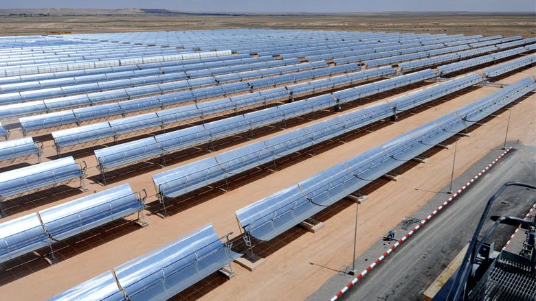
- The media element, before it is interacted with, is a simple image with a logo in the center which indicates the type of media and acts as the "play" button for the media.
- The Hammer communicates the media type (e.g. Video, audio, slideshow), and can optionally display a publication date.
- The Title shows the title of the media, and acts as a link to the source of the media.
Behavior:
When the Media type icon is clicked, the media will take on the control scheme of the platform which the media is hosed on, until that point all controls are hidden.
Editorial:
The Title should reflect the title of the of the source media.
- Topic, Trade, Overview:

